
Does disaster frequency follow power laws? It's complicated

Disclaimer: This is a huge topic, and I’m barely scratching the surface here. I’m not an expert on these subjects, and am mostly trying to summarise the work of experts in an accessible way.
Introduction:
One of my chief complaints about the field of existential risk prevention is that it often relies on estimates that are not well-grounded in empirical evidence. But I want to be clear that some empirical data on threats to humanity does exist and can be analysed in statistically meaningful ways. Obviously we don’t have any data on the incidence of global human extinction, but we do have data for other measures of danger, like earthquake magnitude, tornado speed, deaths from terrorism, and many others.
Furthermore, in many cases these threats appear to closely follow statistical patterns. The most commonly attributed statistical pattern is something called a power law distribution. If you’ve heard of the “80-20” rule, or the Pareto distribution, these are referring to power laws. The list of phenomenon which have been attributed to power law behaviour is frankly ridiculous. Here is a non-exhaustive list of topics we will mention in this post:
Wiki contributions, Word frequency, scientific citations, web hits, books sold, telephone calls received, earthquake magnitude, moon crater diameters, solar flare intensity, war deaths, individual net worth, name frequency, city population, asteroid impact energy, earthquakes, topographic depressions, sinkholes, tropical cyclones, rain cluster areas, rain total precipitation, terrorist attack deaths, flood intensity, and wildfires.
In this article, I will explain what power laws are, where they have been observed, a little on what causes them, and some of the objections that have been raised to seeing power laws everywhere. I will conclude with a brief section on whether any of this is helpful for estimating existential risk.
Part 1: Explaining power laws
What is a power law distribution?
This section will mostly be summarising this great journal article by physics professor Mark Newman from the university of michigan, published in the journal of contemporary physics. I will add in some elaboration on points I think are important to understand. If you want to know more, I recommend reading the whole article here.
The power law is a function that occurs for systems where we measure some value x, like the diameter of asteroids or the number of citations for a scientific article. In cases where power laws are seen, the potential values of x will vary over orders of magnitude, so you might see one paper with 10 citations, and another with 20,000. In a power law situation, these x values follow a probability distribution function where the probability density at some value x is inversely proportional to x:1
p(x) ∝ 1/(xα)
The constant here is incredibly important, as it defines how rapidly extreme values will drop off in likelihood. If your value x (say, the population of a given city in your sample) increases by a factor of 10[2, for example, this formula says that the probability density of finding that value will drop by a factor of 10α. For example if α is 2, it will become 100 times less likely, if α is 3 it will become a 1000 times less likely. If you plot the probability density against x on a log-log curve it will produce a straight line with slope alpha. Newman demonstrates this with a power law distribution alpha of 2.5, looking at a million randomly generated power law samples with logarithmic binning:
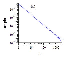
A problem with this way of defining the power law is that probably density functions are kinda hard to interpret on their own. The formula is describing probability densities, not actual probabilities: to get an actual probability you have to integrate them over some value range. For example, you could do some calculus to the number above to get the probability that a city is between 1000 and 1100 people.
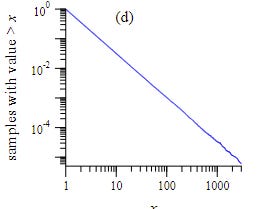
A more appealing approach is often to plot power laws using a “complementary cumulative distribution function (CCDF). That sounds like a mouthful, but what it actually means is that you are plotting the probability, for each number X, that a random new sample is greater than X. So if your CCDF value for a population of 1 million is 0.2, that means that there is a 20% chance that a new city in your dataset will have more than a million people in it.
The CCDF also follows a power law, but with a slope 1 less than alpha.3 This means that if you look at the probability of finding a city with more than 1,000 people in it, and compare it with the probability of finding a city with more than 10,000 people in it, your X value has multiplied by 10, so the probability will drop by a factor of 10(α-1). So if your alpha is 2, then (α-1) is 1, and a 10x increase in your parameter x leads to a 10x drop in the probability that a random value is greater than your given x value.
P(x>X) ∝ 1/(Xα-1)
Hence, plotting a log-log curve of the CCDF will get you a graph where the slope is α-14. You can derive CCDF numbers directly from the actual data, by equating the probability with the actual number of occurences. Here is the equivalent result Newman gets for his toy model:
Now, the correct procedure to get the alpha from the graph is more complicated than just plotting this graph in excel and taking the line of best fit, but doing that will get you a decent approximation. Some detail on best practices using maximum likelihood functions is described in this other paper by Clauset, Shalizi, and Newman.
Newman’s paper goes over many, many examples of power law behaviour in empirical data. The following graph shows 12 different examples:
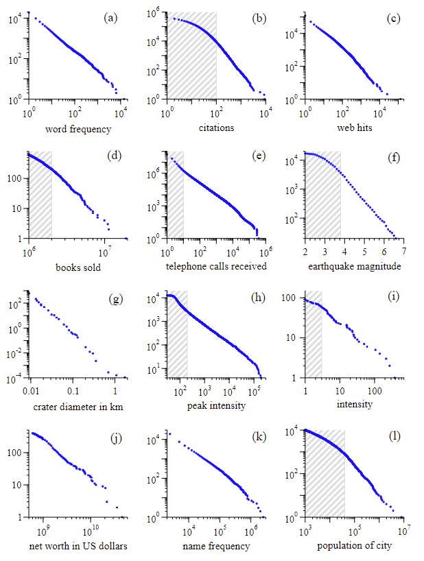
We can see some patterns between them: note that the linear behaviour seems to become noisier and less well defined towards the higher end of the range. This is totally normal and what you would expect: these long-tail events are extremely unlikely so theres not many of them, which makes it noisier and harder to see a pattern.
Another point is that the majority of these phenomenon don’t exhibit power law behaviour over the entire range of values. If we look at scientific citations, for example, the data clearly does not follow a straight line until we get to 100 citations or more. In the graphs above, the shaded areas are where the power law hasn’t “kicked in” yet.
Another interesting trend in Newman’s data is that the exponents of the various power laws described are surprisingly narrow in range, typically having values between 2 and 3, with the lowest value of 1.8 and highest of 3.5:
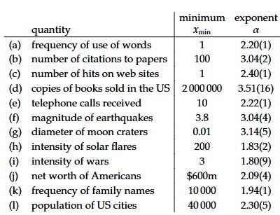
The above table already shows three examples of “danger” type parameters: the amplitude of earthquake waves (alpha=3.04), the intensity of solar flares (alpha = 1.83), and the intensity of wars (alpha = 1.8). In part 2, we will discuss many more examples of these.
But first, let’s talk about some of the conceptual reasons for power law behaviour to occur.
Why power laws:
Why is power-law-like behaviour seen in so many different domains and metrics? From my reading, there is no consensus on any one cause for this, even to explain a single phenomenon. It seems to be a case where various different physical causes can exhibit similar patterns in a mathematical sense.
This entertaining youtube video explores four different explanations for “zipfs law”, a power law in the frequency of word usage.. Newman’s paper explores the six most popular proposed explanations in the section “Mechanisms for generating power-law distributions”, as well as some reasons why non-power laws might be mistaken for power-laws over certain ranges.
I won’t go over all of these proposed sources because it would balloon this post to an absurd degree. But I will highlight one of the explanations that I find most interesting, the idea of distributions arising from situations that are “scale-free”.
To quote Newmans paper:
“A power-law distribution is also sometimes called a scale-free distribution. Why? Because a power law is the only distribution that is the same whatever scale we look at it on.”
What this means is that the distribution looks the same regardless of the scale you are looking at it. Newman gives an example of what this means, with file sizes
“Thus for instance, we might find that computer files of size 2kB are 14 as common as files of size 1kB. Switching to measuring size in megabytes we also find that files of size 2MB are 14 as common as files of size 1MB. Thus the shape of the file-size distribution curve (at least for these particular values) does not depend on the scale on which we measure file size.”
He shows that the power law is the only distribution with this property!
This gives us some intuition as to why would expect the distribution of file sizes to follow power law behaviour. We expect the patterns governing file size usage to be pretty similar whether we are talking about kilobytes or megabytes, so we should expect to see the power law holding in this range. Of course, there are limits here when file sizes get high enough, so we can’t assume it will hold if we ramp everything up to X.
Incidentally, this “scale-free” property means that power law distributions are sometimes associated with mathematical fractals, for example in the title of this paper. Fractals refer to images which look the same no matter how much you zoom in on them, much like the power law describes phenomenon that act the same no matter how much you zoom in on them. In this sense, we can kinda expect that the more “fractal-like” a phenomenon is over a given range, the more likely it is to observe a power law.
Are they really power laws?
Another explanation for the seeming ubiquity of power laws is that a lot of distributions can be mistaken for power laws if you’re not too picky. The statistician Cosma Shalizi has a nice blog post on this. He emphasises that when you do statistical tests of whether something fits to power laws, you should also be checking whether other distributions fit just as well.
A lot of stuff that isn’t really power-law will look like power-laws if you squint enough, and are selective enough. If you zoom in on a log-normal distribution, for example, you can mistake the peak for a straight line, and declare a power law distribution when there isn’t one.
This article, which analyses the trend of contributions to wiki platforms, has a nice comparison of four different distributions which appear power-law like over a large range, but deviate at some point:
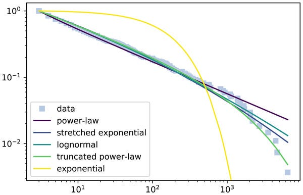
While this data looks like a power-law over 3 orders of magnitude, the higher datapoints reveal that it is a better fit to the truncated power-law distribution, which follows power-law up to a certain point and then breaks into an exponential decay.
Additionally in many cases the power law behaviour will only apply to a portion of the data. Often, the power law behaviour will only kick in after a certain value, and it will then fall off at some point as well.
However, I should say that an approximate power-law for some defined range can still be pretty useful, depending on what you are trying to do. For example, a risk manager might be pretty happy to have an approximate formula predicting the likelihood of floods between some range of values, even if the formula doesn’t apply everywhere.
So overall, I don’t think it’s a big deal to use power-law approximations, as long as you are aware that they are approximations, and in which regime the law seems to hold. The danger would be something like extrapolating out a power law to far past where you have data, and assuming that it holds in that regime as well.
Part 2: Examples of dangers:
Asteroid strikes
First, let’s take a quick look at this graph of the impact magnitude of asteroid strikes, found here, attributed to Asteroids IV, 2015, Michel, DeMeo, and Bottke (eds.), University of Arizona Press.
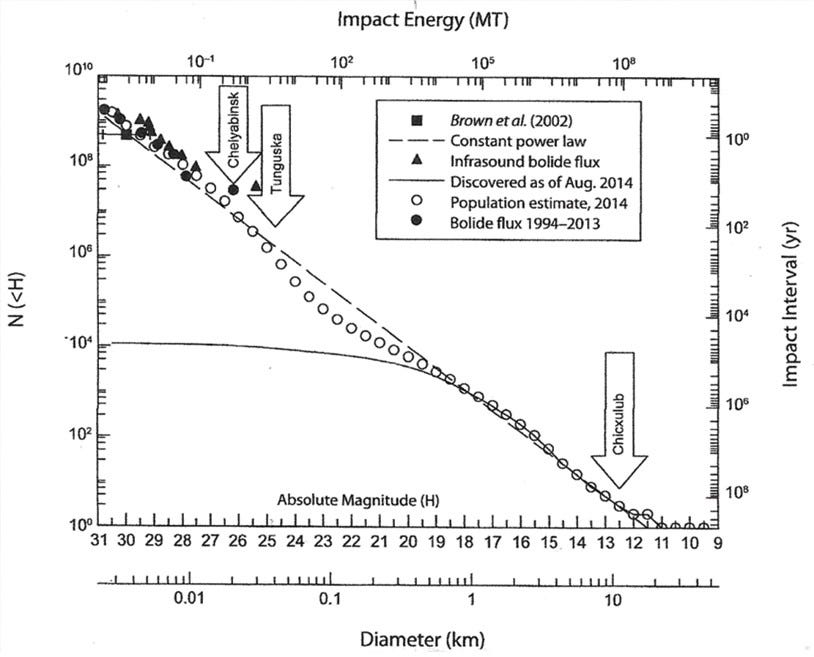
You can see that the impact energy of asteroid strikes mostly follows a power law distribution over several orders of magnitude. However, towards the middle of the graph there is a slight dip in the curve where it deviates from the ideal behaviour, before returning to the ideal behaviour for higher impact energies.
One other point of interest is that we have two different measures of danger here, the impact energy and asteroid diameter5, which both follow the same power law! However, these two measures have different power law exponents: the alpha for the diameter is something like 3.3, whereas the alpha for the impact energy is lower at around 1.8. Presumably this is because there is some proportionality between the two factors (ie, the energy could be proportional to the cube of diameter).
This reminds us that power laws can be reasonably flexible as to what you are measuring: if one factor follows a power law, a lot of simple functions of that factor will also follow the power law.
Floods:
The paper The applicability of power law to floods, by Malamud and Turcotte, examined various datasets on the occurrence of river flooding. The following is one of their estimates, looking at the daily mean discharge of water through the Elkhorn river in Waterloo, NE, in m3/s. They fit a power law distribution to the data and estimated a power law exponent alpha of 2.1:
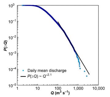
Now, it’s true that a portion of the curve does look like a straight line on this log-log graph, following power law behaviour. But if you look at the data as a whole, it really doesn’t look that straight overall. It seems like a downward curving distribution, like the lognormal distribution, might fit better here. In my opinion, they don’t do enough to rule out alternative distributions here, but I’m not a statistician.
The drop off at high flows isn’t that surprising, because for a lot of physical phenomenon a trend like this is guaranteed to fail at some high level. You can’t just extrapolate the trend and declare that there is some small but finite probability that the discharge will be 1 trillion m3/s-1, because at a certain point such a discharge becomes physically impossible to fit in the river. Many power laws in nature are similarly guaranteed to fail at some point due to some physical limit that can’t be overcome. For example, you can’t have a wildfire that is larger than the surface of the planet earth.
The authors do acknowledge that “it should be emphasized that the applicability is at best approximate”. And viewed as an approximation, this pattern could still be useful, as long as you aren’t taking it too far.
Wars
It has been claimed that the intensity of wars (deaths/ total population), follows a power law over some domain. What’s interesting in this one is the differences in the power law exponent between different estimation methods.
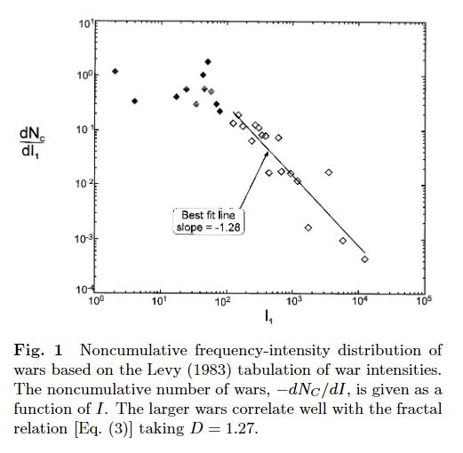
In this paper by Roberts and Turcotte, a set of researchers analysed a list of 119 wars from 1495-1973. The number of deaths in each war was scaled to adjust to the population at that time (called the intensity), and then examined to determine the statistical relationship between them.
They found that the intensity of wars followed a power law distribution for large intensity wars, but not for small ones. The exponent alpha they found was 1.28:
Then, they took a separate dataset of wars, compiled by Small and Singer. This dataset consisted of 118 wars between 1816 and 1980, and used a different method to correct for differing populations. When they conducted their analysis on this data, they again saw a power law pattern, but this time the alpha exponent was 1.4 instead of 1.28. When we are talking about exponentials, this is not a trivial difference!
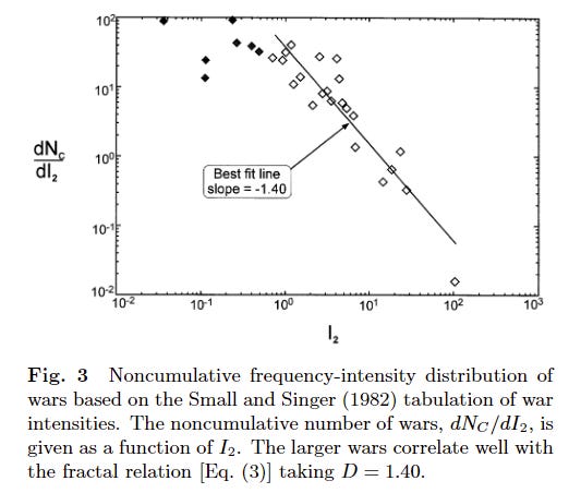
But it gets better: The Newman paper that I’ve discussing a lot so far also analysed the result, using the exact same Small & Singer data as in the last graph. They also found a power law, but in their case, the exponent was 1.8. That’s a much higher exponent using the exact same data.
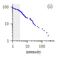
For reference, with an exponent of 1.4, a 1000 fold increase in deaths would result in a probability density drop of factor 16,000 , whereas with an exponent of 1.8, the probability drop would be a factor of 250,000.
Why is there such a difference between measurement of the exact same data? It’s probably due to the technique used to calculate the data. Possibly one explanation is a different choice of cut-off for when the power law “starts”. In the graph above you can see they show a shaded area which is excluded from the power law calculation: it seems like the two papers have picked a different point from which to start this measurement.
Next, the technique is different: Roberts and turcotte derive their values by calculating a derivative of the data over five consecutive measurements, whereas Newman uses a maximum likelihood function technique. I think the latter method is more credible, so I would trust it more, but I am not at all an expert in this matter.
Overall, the power law behaviour does seem to be real, but we can’t assume that the exponents we find are super precise: it depends on calculation and which data is used.
Earthquakes, sinkholes, wildfires, cyclones, rain , and fireballs
Okay, that seems like a lot to shove together into one section, but fortunately they have all been analysed in a single paper: Power Law size distributions in geoscience revisited, by Corrall and Gonzalez.
They looked at 15 different geoscience datasets, covering all of the things above. Quoting the paper: “EQ, TD, SH, TC, CA, and TP denote earthquakes, topographic depressions, sinkholes, tropical cyclones, rain cluster areas, and rain total precipitation, respectively.”, the results are summarised in the following table, where the exponent α is here β6
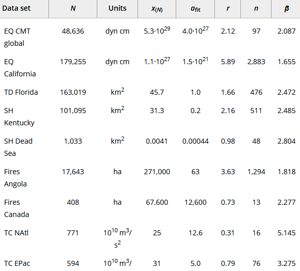
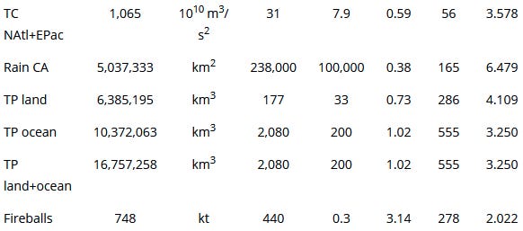
So, that is a ton of data on many different geoscience metrics, a lot of which relate to various forms of danger. All of them can be used to produce power law fits, with exponents that range from 1.6 to 6.4, although most typically between 2 and 3.5.
Let’s look at the actual graphs corresponding to some of the above metrics:
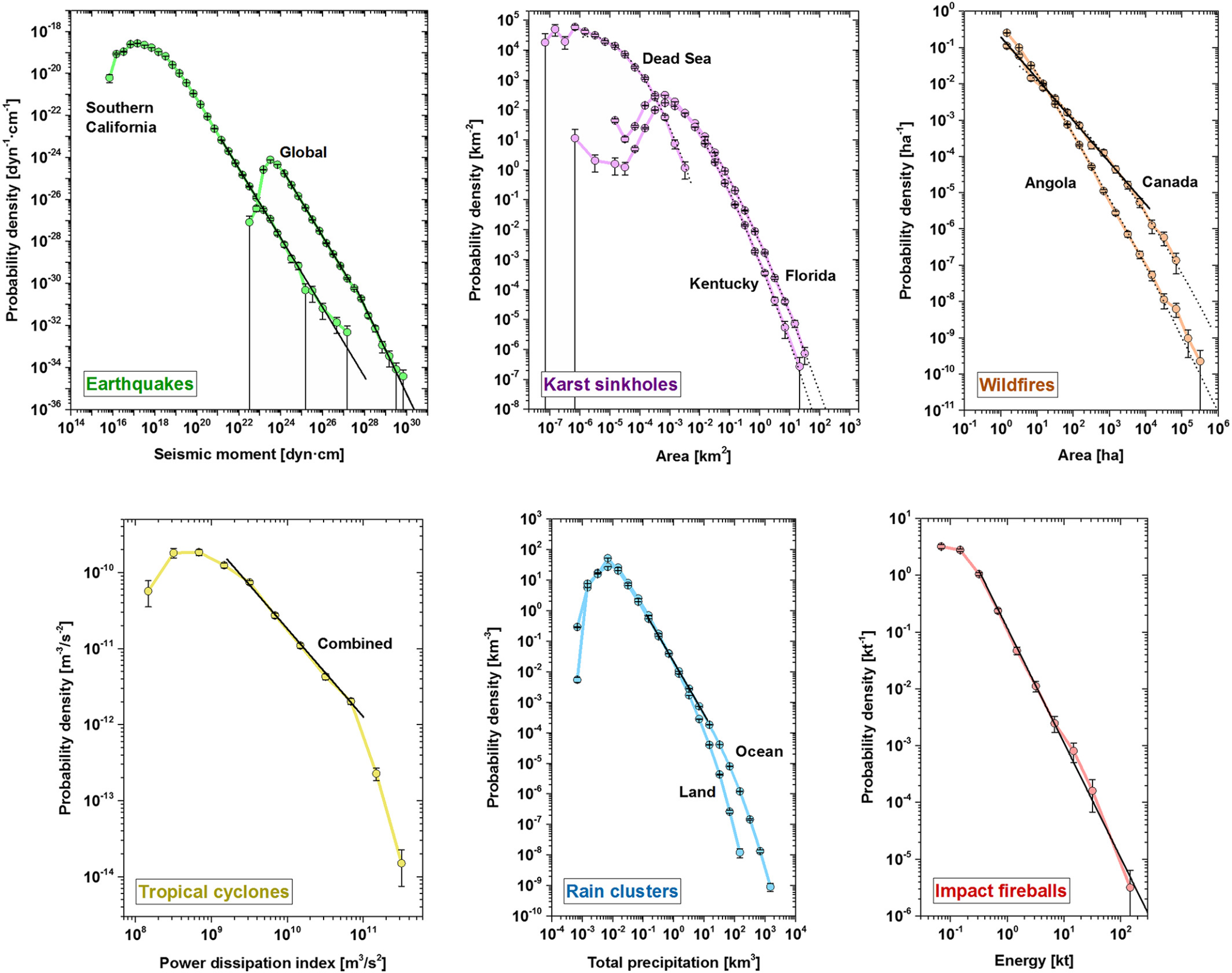
Here we can see pretty clearly that a lot of these phenomenon only follow power-law beaviour within certain ranges. If you took the rain clusters, for example, and zoomed in on only the data between 10^-2 and 10, it would look like a perfect power law relation over 3 orders of magnitude. But below and above this, the results deviate significantly. The Karst sinkholes have a particularly odd behaviour, dipping down and up before ending up in a power law behaviour.
The thesis of the paper is not actually that all these phenomenon are power laws. They actually find that while you can fit a power law to all of these phenomenon, that is often not the best descriptor for each phenomenon. To quote the abstract:
“We confirm that impact fireballs and Californian earthquakes show untruncated power law behavior, whereas global earthquakes follow a double power law. Rain precipitation over space and time and tropical cyclones show a truncated power law regime. Karst sinkholes and wildfires, in contrast, are better described by truncated lognormals, although wildfires also may show power law regimes.”
Terrorist attacks
This paper here from Clauset, Young and Gleditsch looked at the frequency of different terrorist attacks with different numbers of victims. They examine a time period of 50 years leading up to 2008, with over 13000 datapoints, and find a pretty clear power law trend, with a power law alpha exponent of 2.4:
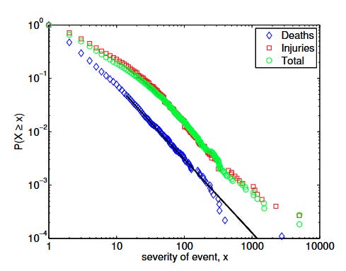
Note that once again, this is showing the cumulative distribution, so the slope of the graph is α-1, not α. The blue value at the very bottom of the graph is 9/11.
It is pretty interesting that something like terrorist attacks follows a distribution like this, given the wide variety of methods that are used in terrorist attacks. Someone flying a plane into a building is quite different in substance to someone stabbing a guy in the street, and yet when collated in aggregate they seem to lie along the same trend.
The authors speculate on an explanation for this. They made a model where terrorists investing time into a plot allows them to kill exponentially more people, but also as a result of spending more time, they are more likely to be discovered and thwarted. They show that the result of this cat and mouse game is a power law distribution like the one above.
Because this spans a 50 year period, the authors were able to actually check how the exponent varied over time, by limiting their fitting procedure to the time around a certain year. The following graph shows their results:
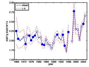
We can see that the exponent of the power law relation can shift quite a bit over time, drifting from as low as 1.75 to as high as 2.75, which given the exponential nature of things is quite a significant difference!
Can we estimate extinction risk:
So with all this data, is it possible to make an informative estimate of something like existential risk? I say, generally not. We can use the terrorist attacks above as a reference, as they seem to hold pretty closely to a power law for the observed data.
If you plug in the data fit, and extend it out, and assume the same number of terrorist incidence per year as in this sample, it will spit out the result that the probability of extinction from a terrorist attack in the next 50 years is 3 in a billion. The problem is that when I say “extend it out”, I’m talking about an absurd level of extension, more than 6 orders of magnitude beyond the realm where we have data:
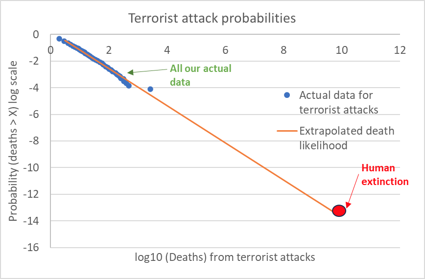
But from all we have seen so far, I think an extrapolation like this is not likely to be informative. It’s fairly common for a trend to exhibit power law behaviour for many orders of magnitude, and then suddenly break the pattern and collapse once a certain threshold is crossed. We have no way of knowing when or if this trend will drop, but I really would not bet on it holding up over such a large range.
It also neglects how the severity of terrorist threats can change over time. As we saw, the slope of the terrorism power law is not actually constant over time. We should consider that future technology could drastically change the threat profile of terrorism, by making it either harder or easier to pull off attacks.
I think similar concerns will apply to almost all other threats to humanity as well. The only exceptions would perhaps be something like asteroid risk, because we actually do have data on the frequency of apocalyptic sized asteroid strikes. Even there, we run into problems because we have to account for the chances that humanity successfully deflects such an asteroid.
Conclusion:
Real world data is often messy and random, so it feels incredible when you study something and that messiness seemingly clears away to reveal clear statistical patterns. At first glance at the topic, it seemed to me like power laws were everywhere when it comes to disasters, at least ones ranging several orders of magnitude in danger.
After looking into it some more, I think the picture is more mixed. I think it’s very common for phenomenon to exhibit power-law behaviour over a decent range of values, but this doesn’t necessarily mean that these phenomenon follow actual power laws.
This doesn’t matter too much if you are trying to predict phenomena near the range that you have lots of data for. Approximate statistical rules can still be useful for planning purposes. But it means that any attempt to extrapolate these “laws” well past the point of reliable data collection is questionable at best.
Statistical patterns like power laws should be treated like tools: use them for the correct purpose, and always be aware of their limitations.
Further confusing things, “α” is sometimes referred to as “beta” in different papers
footnote: the number 10 is not special here. It is also true that threats that are 3x more dangerous are 3^α times less likeley, threats that are 7x more dangerous are 7^α times less likely. As a fun exercise you can try proving why with the above equation.]
To understand why, think about going from 10 to 100: the probability may drop by 100, but the actual range of x has increased by a factor of 10
The fact that some graphs can have a slope of alpha, and others will have a slope of alpha-1 tripped me up quite a big while writing this article. I think it’s easier to conceptualise the CCDF form.
Or possibly crater diameter?
because it wasn’t confusing enough to research this stuff